Improve Now Playing View on Desktop & Web
-
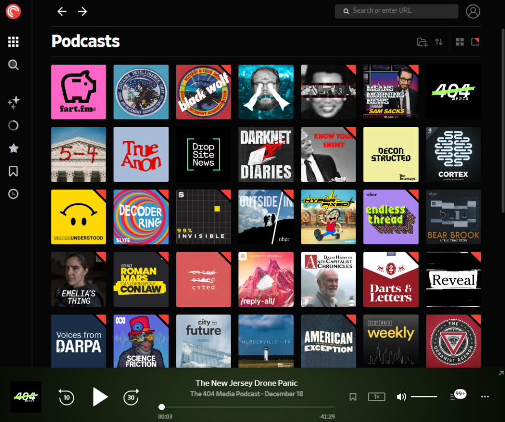
I request an improved Now Playing view in the Desktop and Web Apps to match that of the Android and iOS apps.
At present, Now Playing lives at the bottom of the screen. I would love a dedicated full-screen view similar to the mobile apps; I am not a fan of constantly viewing all my subscriptions/follows (see below).
With the current user interface episode artwork is near impossible to see, navigating chapters is painful, and you cannot view chapter artwork in the desktop or web apps.
-
That’s a great idea. I have forwarded your feedback as a feature request to our team. Thanks!
-
+1. This is personally the most important feature missing in the desktop app and website.
